Readability in Arabic-Persian Scripts _________________________________________________________________________________________________
Typeface as an applied medium has played an effective role in human growth and awareness. Comprehension only takes place when the reader has an interaction with the text. To comprehend a text, readers should first read it. Working memory has a limited capacity. Thus, to give the short-term memory a chance to comprehend the text, there should be some levels of automatic decoding at play. If too much energy is required for recognizing the words, less mental energy will be left for comprehension. That is why the readability of a typeface is so important. In this article, we intend to examine the readability factors in Arabic scripts.
Calligraphy
Calligraphy in essence means the art of writing beautifully. Arabic calligraphy can be found since the dawn of Islam with the Quran manuscripts among the Muslims. According to Burckhardt (1990): “The noblest, most extensive art in the world of Islam [1] is calligraphy, and The Quran is called the holy art. The calligraphy in Islam plays the same role as iconography [2] in Christian art [3] because it represents the Divine Word.”
Calligraphy is known as the most important and accepted form of Islamic Art. Need and necessity led to the creation of new styles and schools of calligraphy. Since calligraphy was never a single and isolated form of art, it has always been reshaped based on the contemporary needs of people in accordance with the new requirements and different styles and was used for different purposes. These forms include Naskh [4] , Mohaghegh [5] , Reyhan [6] used in the Quran and scientific and jurisprudential manuscripts, Thuluth [7] dedicated to luxurious books, and inscriptions.
All scripts in the Arabic-Persian language follow the same principles in their root, which is the principle of the alphabet. This rule has four sub-categories that together guarantee the beauty and readability: “baseline”, “proportion”, “composition”, and “principles”
Typeface
In typography, a typeface is a set of one or more fonts, each composed of glyphs sharing a common design and similar features. The most important issue differentiating type design from calligraphy is the need for every glyph in the typeface to work with every other glyph. This means that we can think about typeface design as the creation of a wonderful collection of letters.
A typeface is a medium that conveys a message to the audience at its best. A type designer in the process of its design combines beauty with practicality and eloquence in order to meet the needs of the targeted audience. As a result, the audience participates actively in reading the new font. This requires designers to recognize the needs and the tastes of their audience. What we know today as the Arabic-Persian calligraphy is the result of constant changes and manipulations that have been trimming and polishing the scripts throughout history in order to enhance the beauty and readability. Preserving these heritages is the responsibility of type designers as the new generation of calligraphers. Therefore, in order to design a beautiful and functional font in terms of readability, they must be subject to four common principles between all types of Arabic script.
More about the four main rules:

Table 1. Comparison of calligraphy and font design in the principles of beauty and readability
Principles:
“Principles means root and foundation that refers to things such as strength and weakness, the pen angle, the straight and curved forms, and the black and white space in the loops”
The angle of the pen in the Arabic-Persian calligraphy can be determined by the letter’s transformation in thickness in the loops and turns it is visible in the letters ending.

Figure1. Display the minimum and maximum thickness of the pen and its location in the letters in the Naskh script
In Arabic letters, when the pen moves horizontally and parallels to the baseline, the entire width of the pen is placed on the paper. Therefore, the thickest parts of the letters are the horizontal parts. In vertical and diagonal movements, however, only a fraction of the pen’s thickness is used. Depending on the angle at which we hold the pen when writing, it will change the contrast between the maximum and minimum thickness of the pen.
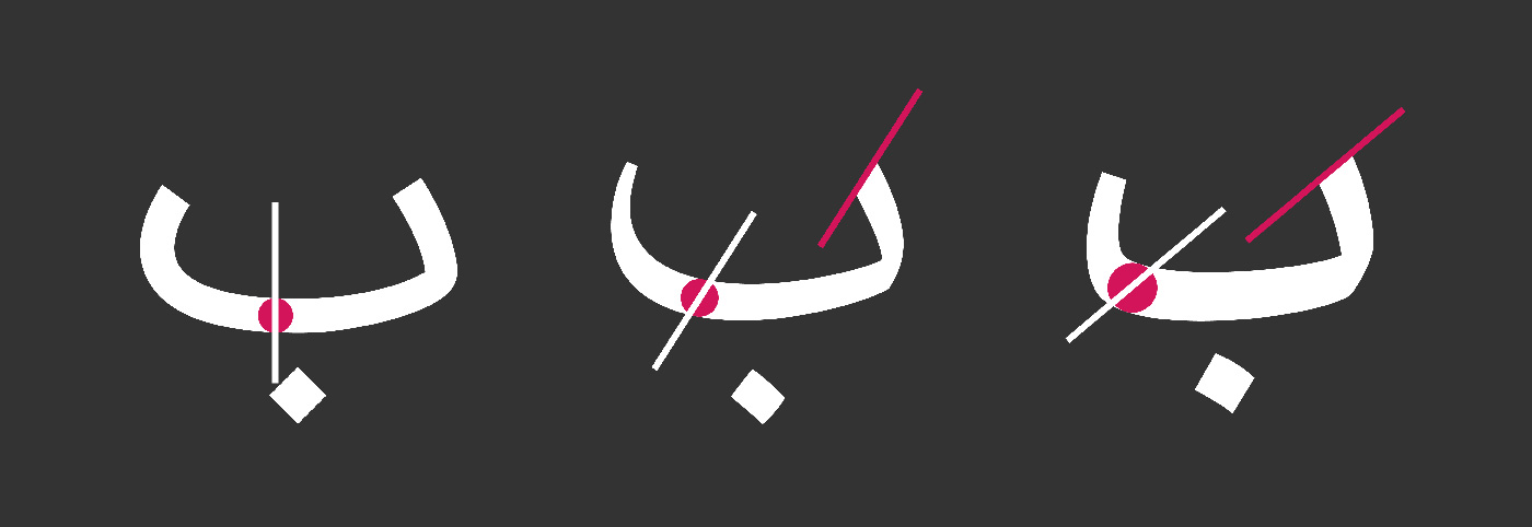
Figure2. Display letter shape change by changing the pen angle
Straights and Curve Forms
The direct movements of the pen in writing are called “straight” and rotation moves of the pen are called “curves”. The proportion between the straight and the curve forms is different in different scripts.
For example, in some scripts such as Naskh, the amount of direct movements of the pen is more than the circular motion. However, we see a different trend in the Nasta’liq script.

Figure3. Difference between the rotation movement of the pen and its direct movements in the Naskh (right) and Nastaliq (left) script
Ratio:
“Ratio or proportion includes similar forms in similar letter and the moderation and proportion in the single individual letters and similar combinations of letters”. In other words, one of the main factors in maintaining the readability of a family of letters is to balance the proportion between black and white spaces. In a family of letters, in order to preserve the balance of the black and white space or the grey space [8] of the text, it is essential for all letters to follow the same rules in pen movement, letterforms, proportions, and the positive and negative balance within the letter and in combination with other letters.
Proportions of the form
The unified writing in similar forms such as bowls, loops, and keshide, leads to a better proportion in the black and white space between the letters, words, and text that eventually increases the eye movement during a reading with less fixation.

Figure4. To create a balanced gray in the text, similar forms such as bowls in س، ص ، ن ، ل، ی and Keshide in ک، ف، ب are written in the same form.
Proportion of loops
The size of the loops plays an important role in readability and the creation of grey balance in text. If the loops are too small, in smaller sizes the negative space inside them disappears, therefore, the balance of black and white space of the type fades away. The shape of the loops in Arabic calligraphy is like a drop of water that spins in different directions in different letters. The loop’s white space should be recognizable in any size if they are designed appropriately. The negative space of Loops should be proportional to each other in order to create a balanced gray in the text.

Figure5. Display the proportion in the size of the negative space of the loops
Baseline:
The proper baseline division in the font design has a direct effect on the scales, sizes, and proportions of the letters. As a result of the correct size and scale in the font design the readability, visual harmony, and beauty increase. Therefore, one of the most important factors in font design is the correct understanding of the baselines. The ratio of the first tooth to the middle one, the ratio of the baseline ‘ف’ to the height of ‘ا’, the ratio of the ascender and descender, the position and scale of the dots, the location of the diacritics, and all the subtleties that can make the letters readable and beautiful.
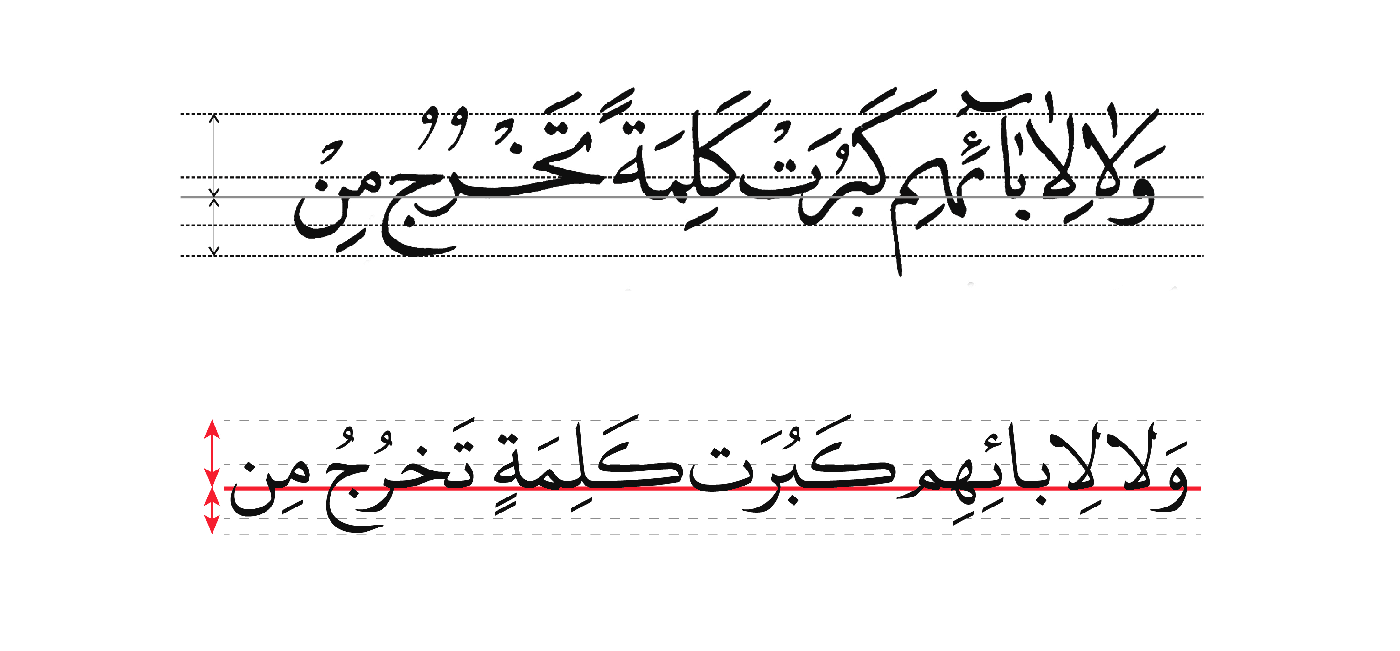
Figure6. Display the baseline in Arabic script
The baseline is classified as follows: ascender, main baseline, and descender. In Arabic calligraphy, there are five baselines to consider: The first is for the apex of the letters: الف، ل، ک; the second is for the head of the letters: د، ر، ص، ط، ع، ف، ق ،و; the third is the middle baseline and relates to the height of letters such as: بـ، بـ and head of the loops; the forth is for the descender of the letters: ن, ق، ی، ل، ص، س; and finally, the fifth is related to the descender of ح، ع. Remaining faithful to these five baselines help harmonize and create rhythms in similar forms and improves readability.

Figure7. Preserving the correct baseline in Arabic typefaces strengthens the structure of the text and as a result, it moves the audience’s eyes smoothly on the lines.
Composition:
‘The composition in calligraphy consists of several components: composition in the letter, composition in the line, composition on the page, spacing, regularity, moderation, the proximity of letters as well as the size of the font on the page’.
In order to write a word in the Arabic-Persian language, letters connect generally, and sometimes they are written separately. All the letters can connect to their previous letter from the right side unless grammatical rules limit it. This creates a gap between the letters in a word and breaks it up. This fragmentation in words causes empty spaces in the text.
Achieving a consistent and balanced grey space throughout the text and within a word is crucial for a successful type design. As mentioned earlier, grey space is one of the scales for readability [9]. In a text, a word, which consists of letters, ratios, and spacing, creates the grey space. Observing the proportions, the width, and the height of the letters in a text and the spacing of the characters leads to a balanced black and white (full and empty) space, this results in a balanced grey for reading and following the text.
In general, there are three categories of spacing in Arabic-Persian writing: 1. Space between letters or tracking 2. Space between words or kerning 3. Space between lines or leading
1. Spacing between letters: A prerequisite for aesthetics and readability of a font is proper tracking between the letters. For example, the letter ‘ر’ and the letter ‘ا’, form the word ‘را’, with a non-adjusted tracking, will look like this ‘ ر ا’. This type of tracking makes the reading difficult for the readers and impairs beauty. Such words can be found in many texts.
2. Spacing between words: The beginning of a word should be accompanied by an appropriate distance from the end of the previous word. This causes a pleasant grey space for the eye
3. Spacing between lines: The spacing between the lines in digital environments is 120% of the space between the ascender and the descender. While this amount is 140% in print. On the other hand, as the number of characters in a line increases, the space between the lines grows
In the next article, we will focus on the correct spacing of letters, words, and lines.
_______________________________________________________________________________________
[1] Islamic art or Muslim art refers to a collection of art or art practices created in the Muslim community, not necessarily by Muslims. Islamic art is not just related to the religion of Islam. The term “Islamic” refers not only to religion but also to the rich and diverse culture of the peoples of the lands where the religion of Islam has been prevalent.
[2] Based on a non-standard translation of the Greek and Russian equivalent terms is the production of religious images, called “icons”, in Byzantine and Orthodox Christianity.
[3] Christian art (early 4th century B.C.) refers to the art of the post-Christian era before the Renaissance.
[4] Naskh script is one of the oldest scripts, but it became more popular after being re-designed by IIbn-Muqallah in the 11th century. This script was transformed by Ibn-Bavab and the next calligraphers into a subtle script suitable for the writing of the Qur’an, and since then, most of the copies of the Qur’an have been written using this script.
[5] The Mohaghegh script is one of the most important styles of Islamic calligraphy, including the six styles attributed to Ibn-Muqallah’s invention or arrangement. Mohaghegh is known as the father of Arabic scripts. The Mohaghegh script is the closest script to Kufic. In this script, letters are uniform, monotonous, and large, with regular intervals and without interference between the letters.
[6] The Reyhan script is derived from Mohaghegh script, has a delicate and small body and all the features of the Mohaghegh script, but is more delicate and has, therefore, been likened to the flower and leaf, hence the name Reyhan (basil). This script has been devised for ease of writing and uses the style and method of the Mohaghegh in writing abstracts.
[7] The Thuluth script, with a static and solemn structure, has been used mostly in the decoration of books and inscriptions. The gradual evolution of Thuluth as a decorative script was formed by Ibn-Muqallah, Ibn-Bavab, and Yaqut Mostasami. Ibn-Bavab brought beauty and elegance to it. In Iran, Thuluth script is used to write the title of the Quranic chapters, book backs, epigraphs, and is still common in inscriptions and tiles.
[8] Grey is considered as one of the readability scales. Observing the ratio, the width of letters, spacing between characters, height and italic of letters in the text leads to the creation of a suitable space of black and white (full and empty), which are a balanced gray for reading and following the text, and we call it suitable gray.
[9] Readability and Legibility: In Persian, these two words are translated in the same sense (readability), but the meanings of these two words are different. “Legibility” includes aspects such as the sharpness of a letter to be read and the degree of difference between letters to distinguish them from each other, but “Readability” is influenced by the type of family of letters chosen for the text and related to the type of spacing and punctuation in the text.
References _______________________________________________________________
Afravi, Bahram. 2008. “Graphic, Aesthetics and Persian writing”, Graphic and Chap the Iranian Practical Graphics & print magazine 5: 17.
Fazaeli, Habib-Allah. 2011. Atlas Khat, First ed, Tehran: Soroush publisher.
Fazaeli, Habib-Allah. 2008. Ta’lim-e Khat, 10th ed, Tehran: Soroush publisher.
Fozouni, Farhad. 2010. “An Introduction to Persian Gynecology”, Dabire 1: 112.
Ghelichkhani, H. R. 2009. Dictionary of vocabulary and calligraphy terms. Tehran: Rowzanehnasr.
Ghelichkhani, H. R. 2013. An Introduction to Persian Calligraphy. Tehran: Farhange Moaser.
Mesghali, Farshid. 2011. Typography. First Edition, Tehran: Nazar Publisher.
Pardo, L.S. 2004. “What every teacher need to know about comprehension”, The reading teacher 58(3): 272-280.
Veruschka, Gots. 1998. Color and type for the screen, published by Roro Vision SA.
16 Responses
Your style is unique compared to other people I have
read stuff from. Thanks for posting when you’ve got the opportunity, Guess I’ll just bookmark this page.
Thank you so much
Oh my goodness! Incredible article dude!
Thank you so much, However I am experiencing problems with your RSS.
I don’t know the reason why I can’t subscribe to it.
Is there anyone else getting identical RSS problems? Anyone
who knows the solution will you kindly respond?
Thanx!!
Thank you so much. i’ll check and fix it
I like the helpful information you provide in your articles.
I will bookmark your weblog and check again here
regularly. I am quite sure I will learn plenty of new stuff right here!
Best of luck for the next!
I am glad that this article was useful for you. And I am glad that you will be with us
I couldn’t refrain from commenting. Perfectly written!
Thank you so much for your kindness
This is very interesting, You are a very skilled blogger.
I’ve joined your rss feed and look forward to seeking more of your great post.
Also, I have shared your site in my social networks!
Thank you so so much dear friend
Hi there, I discovered your website by way of Google whilst looking
for a related subject, your web site got here up, it appears to be like
good. I have bookmarked it in my google bookmarks.
Hi there, simply changed into alert to your weblopg via Google, and found
that itt is truly informative. I am going to watch out for brussels.
I’ll be grateful in case you proceed this iin future.
Numerous folks might be benefited from your writing.
Cheers!
My web-site :: getting cheap travel
It was very good news. Thank you. We will definitely spend more time to improve this site.
Hurrah! In the end I got a weblog from where
I be capable of really take helpful data concerning my study
and knowledge.
Thank you for sharing this opinion with us. Tell us more about yourself.
We’re a group of volunteers and starting a new scheme in our community.
Your site provided us with helpful information to work on. You
have performed an impressive activity and our entire community will
likely be grateful to you.
I am glad that it is so. I would like to know more about your work.