Your brain creates many optical illusions to cope with the dynamic reality and process information around you. In fact, many times your eyes and brain lie to you to make something seem normal to you. Therefore, illusions are natural part of our lives and typography makes no exception.
Typeface design is not just a simple black space and form on a white background. Type designers often tell lie to control the audience’s eye error, but our eyes believe that lie. We think that what we see is normal.
Ayes full of lines
Look at these three simple shapes. Squares, circles and triangles. Unbelievably, these three shapes are the same size. However, our eyes do not see the same size. When sticking to the same geometrical size, circle and triangle appear smaller compared to the rectangular. In order for all three to be seen equally in the reader’s eyes, changes in size must be made. The triangle grows from its vertex and the circle grows from its upper and lower sides relative to the square.
Since all shapes and forms are made of these three main shapes (circle, triangle and square) in Arabic and Persian letters, we will also encounter these shapes. So the typeface designer will inevitably have to change the font size and position of letters on the baseline to correct the visual error mentioned.
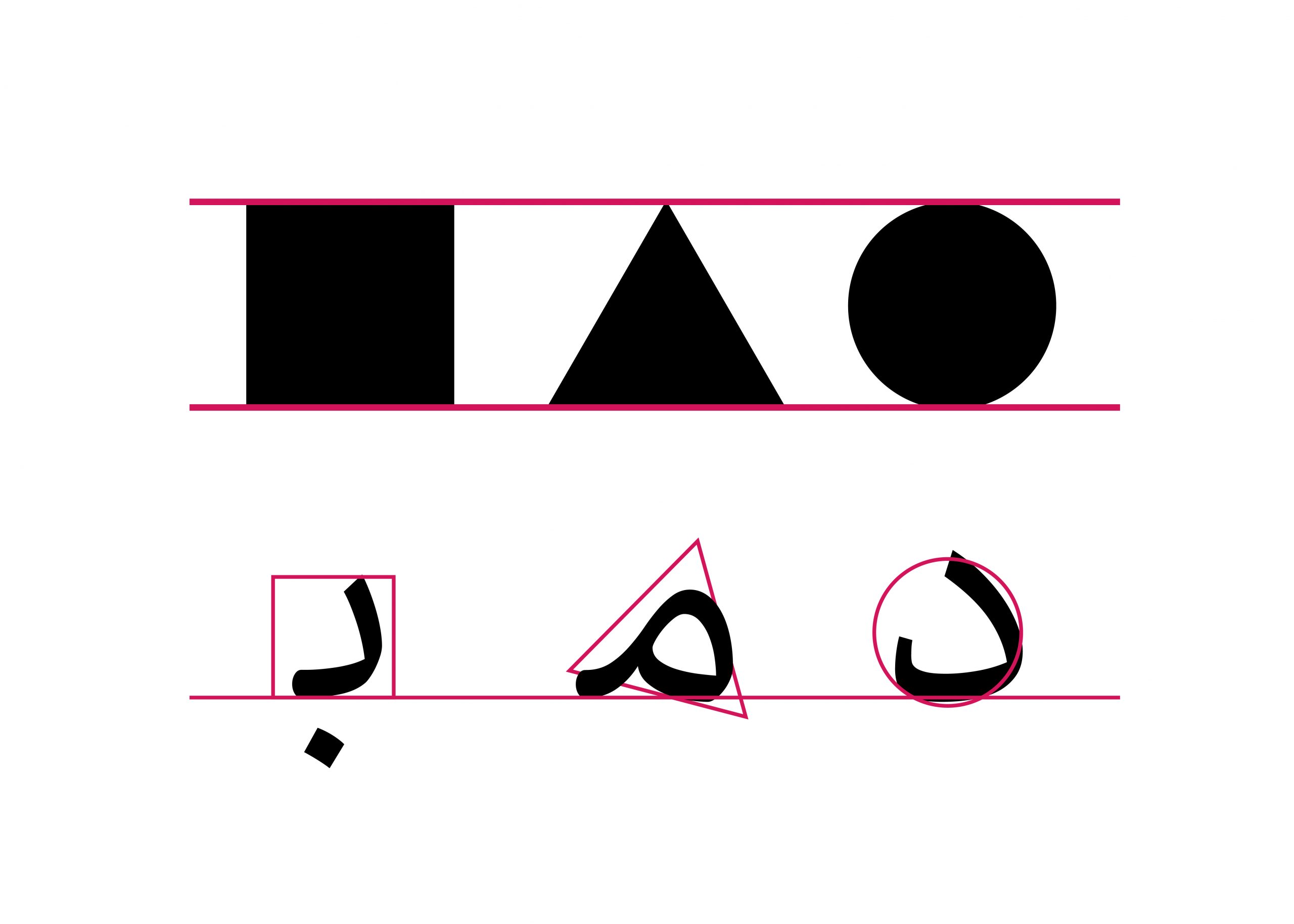
Figure 1: Display basic forms in Persian and Arabic letters
Printed typefaces and Ink traps
Printing means transferring ink to a page to display a form. Sometimes only one color is needed to display this form and sometimes several colors are needed.
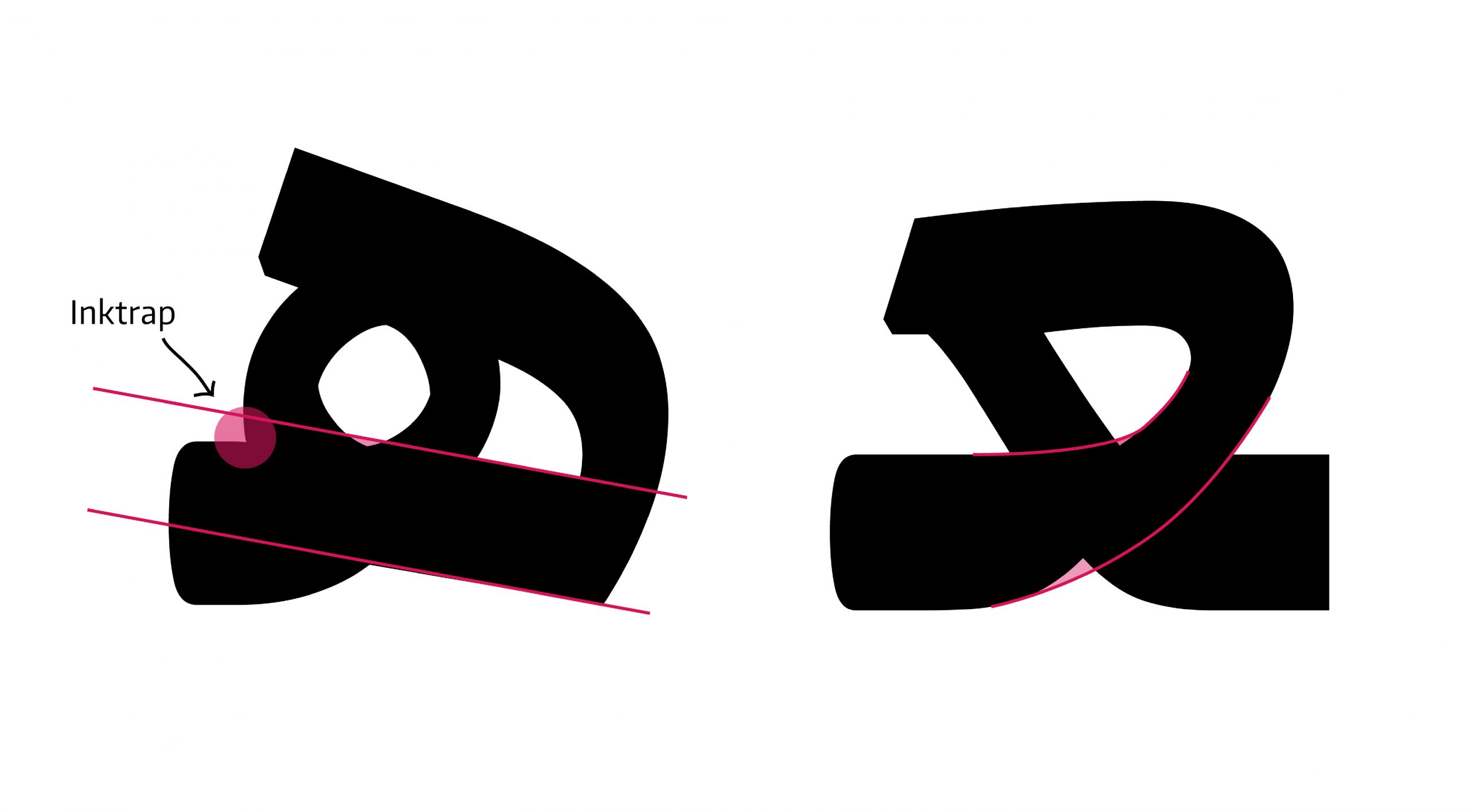
In color images, the printed colors are printed on top of each other in order to create the desired color in the image. Sometimes this color density for a small font causes the color to spread and the letters to thicken and become illegible. To avoid this error, in the past, Arabic-Persian calligraphers have found a solution that is a great help for font designers today. That is called Ink Trap. At an ink trap, the corners or details are removed from the letterforms. When the type is printed, ink naturally spreads into the removed area. This is important that Ink traps are only needed for small point sizes and typefaces with ink traps may be offered in versions without them for display on screen or at larger sizes.
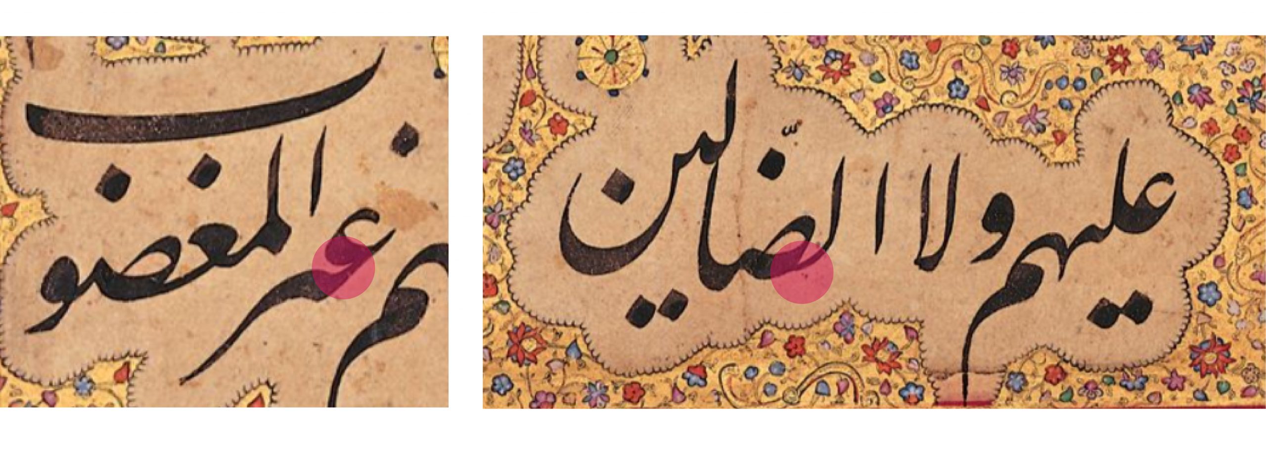
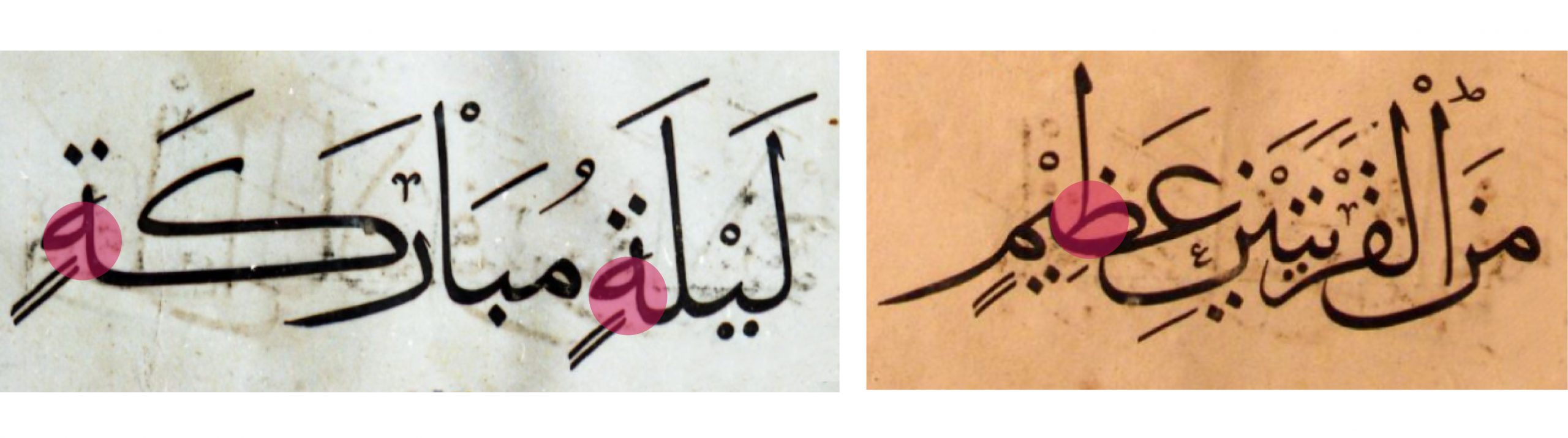
Figure2: Display the ink trap in Persian calligraphy. (Image above) Nastaliq calligraphy by Mir Emad Hassani and (Image below) Thulth Scripts by Ahmad Ibn Sohravardi
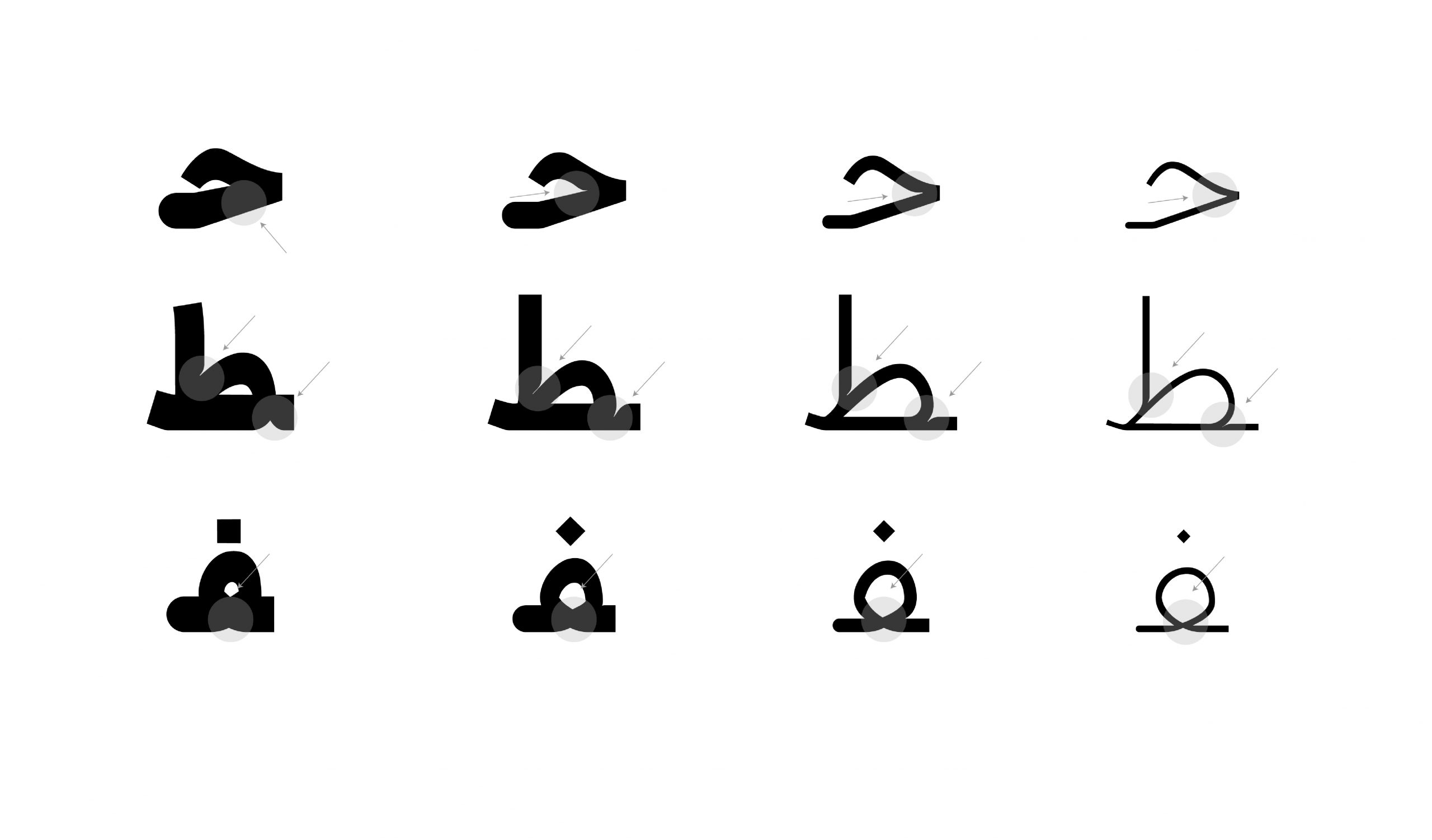
Figure3: Display the ink trap in Persian Typefaces in different letters.
Proportions of the form
One of the main factors in maintaining the readability of a family of letters is to balance the proportion between black and white spaces. In a family of letters, in order to preserve the balance of the black and white space or the grey space [1] of the text, it is essential for all letters to follow the same rules in pen movement, letterforms, and proportions. The unified writing in similar forms such as bowls, loops, and keshide, leads to a better proportion in the black and white space between the letters, words, and text that eventually increases the eye movement during a reading with less fixation.
However, sometimes it is necessary to make some changes in similar forms to control the black and white space. For example, the bowls of ق ل are both the same in angle and pen movement, but the size of these bowls is not the same. The font designer must design bowls of ق larger than ل to control the negative space inside the bowl. Because the loop of ق closes the space.
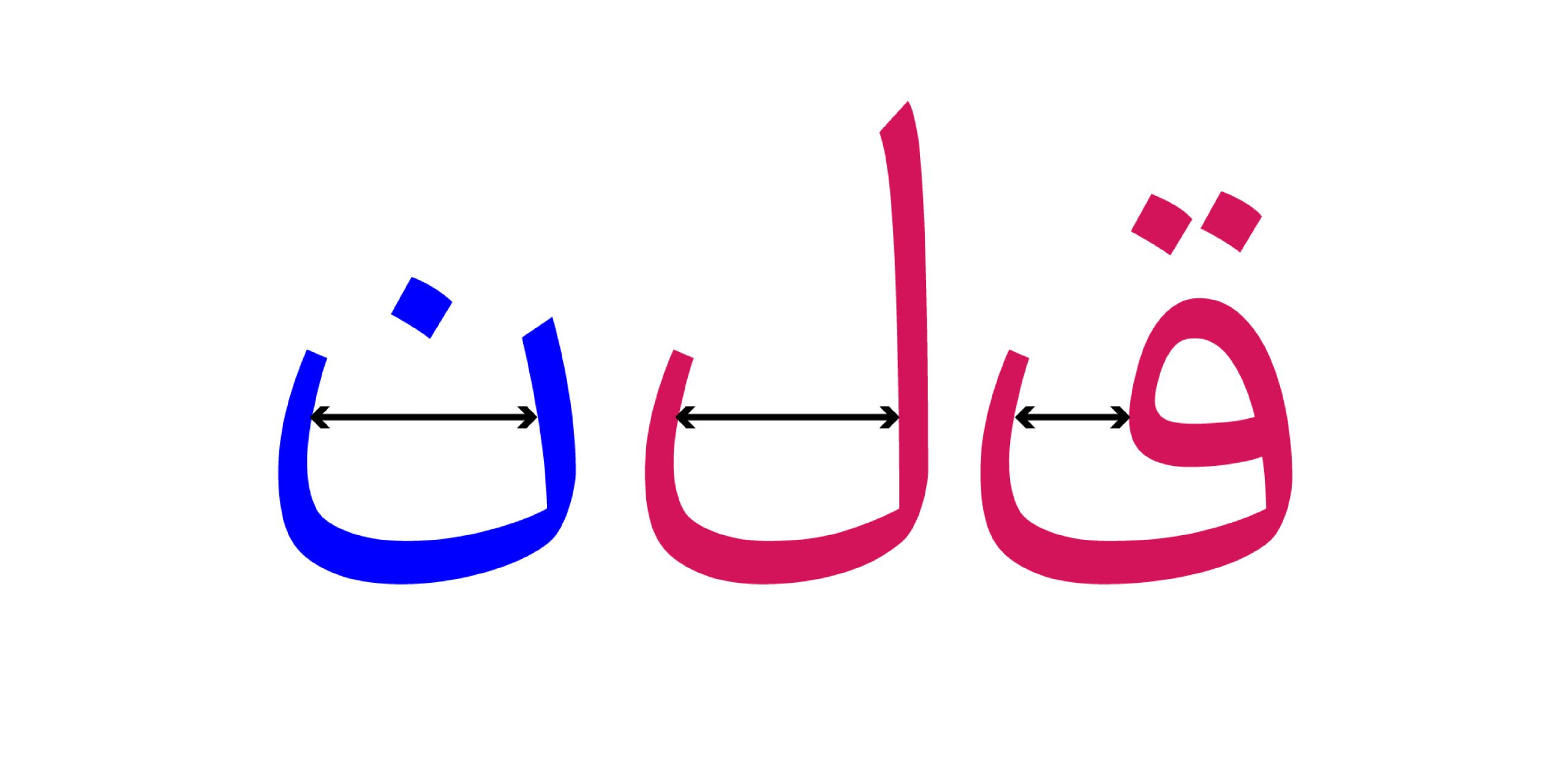
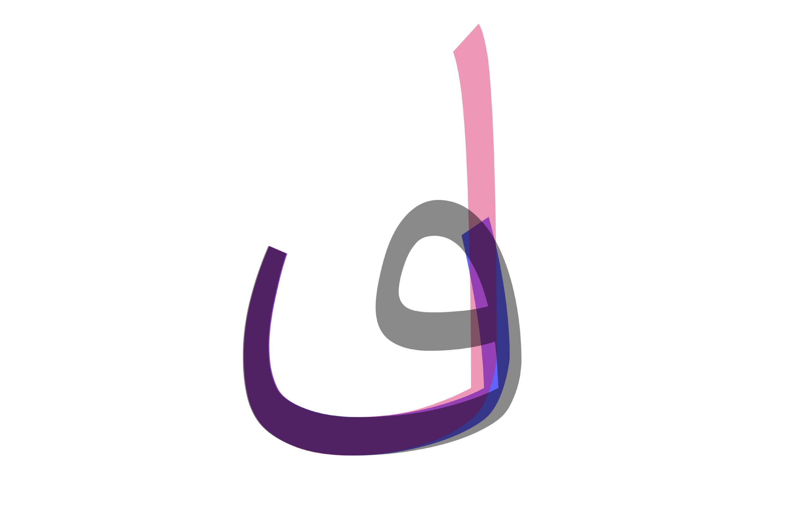
Figure4: The difference in size in the same form of bowls in the letters ق ل ن
Pen Movements in crossing Paths
Look at this form. It seems that the movement of the pen to write the letter A should be such that they intersect like a cross. Nevertheless, it is not. The designer acted differently to control the black and white space. However, in the end, the reader’s eye sees these two movements in the same direction and does not notice this change.
____________________________________________________________________________________
[1]Grey is considered as one of the readability scales. Observing the ratio, width of letters, spacing between characters, height and italic of letters in the text leads to the creation of a suitable space of black and white (full and empty), which are a balanced gray for reading and following the text, and we call it suitable gray.